What if there were no cars passing by Stonehenge?
The largest project I worked on while at MXT was a simulation of what the area around Stonehenge would look like if cars would not be driving close by. National Highways is planning to build an underground tunnel (A303) and our job was to show the striking difference between the present and a future with this new hidden highway. This is a VR experience for persons that may have no experience with VR at all.
The simulation uses real-world data to build realistic traffic and noise that would come with it, before and after the tunnel. We decided to use Unreal Engine even though none of us had experience with it.
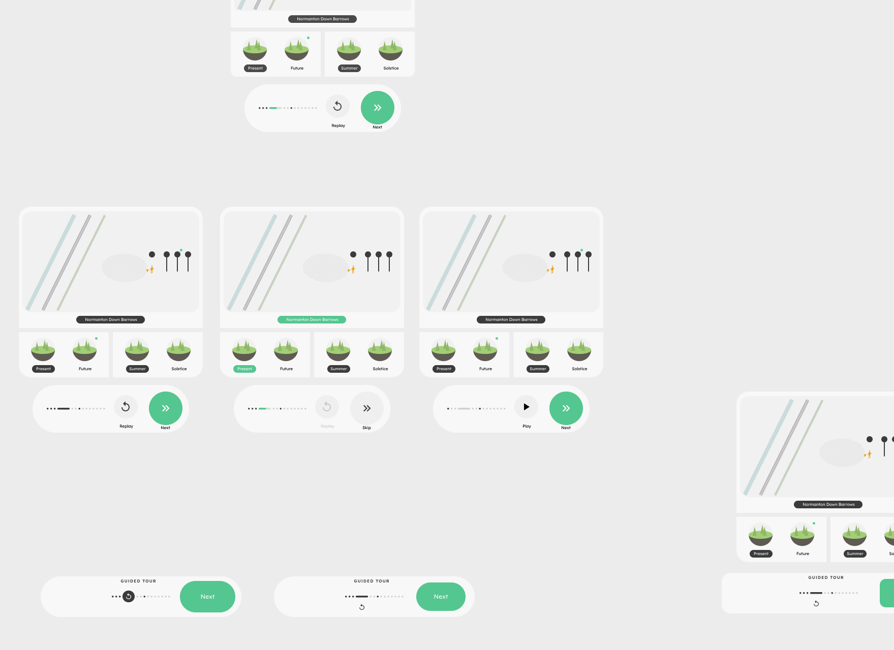
The UI has been carefully designed to fit two seemingly contradictory gameplay flows: a guided tour and free roaming. Despite the challenge, the UI has always been praised during our user testings.
UX was fully on me, from design to the UI implementation. (In this case, that means the whole gameplay.) What would a user with potentially no computer skills see once the headset is on?
User experience
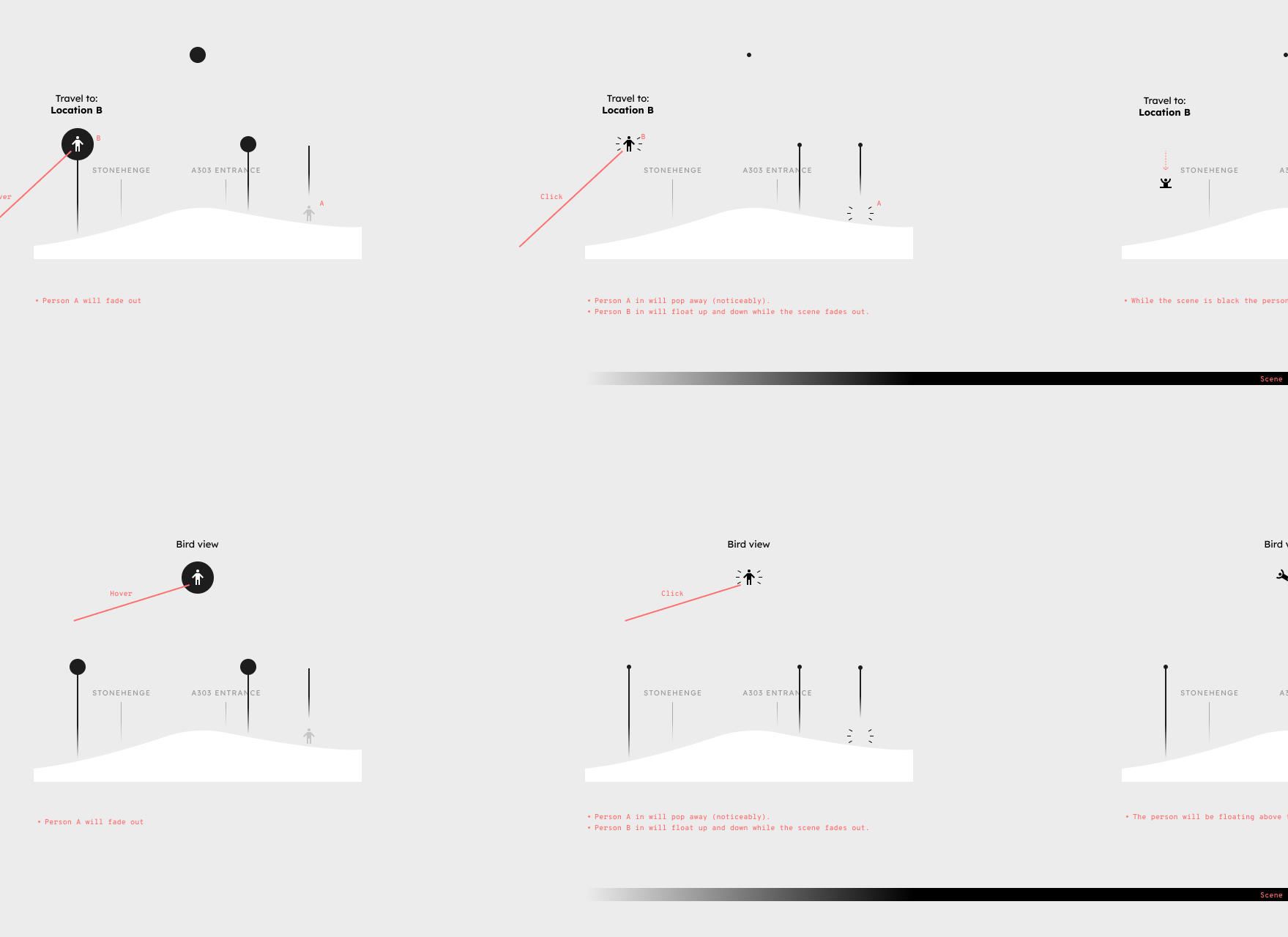
Much has changed since the initial mock-ups but some cardinal ideas persisted: your left hand would function as a tablet-like interface, while the right as a laser to point and select interactive elements; keep diegetic UI to a minimum; the user should never feel lost or confused on what to do next; have as few explicit tutorials as possible.
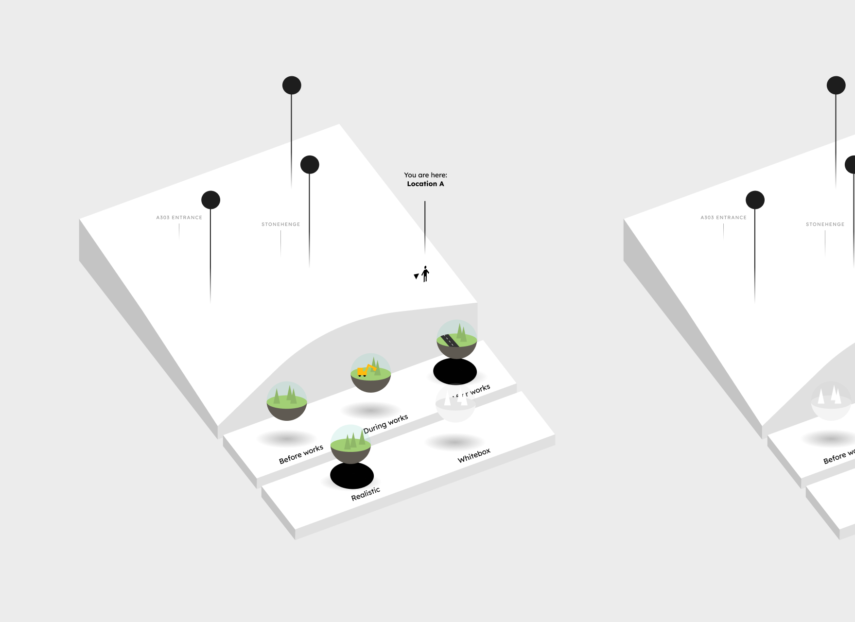
There were so many details I had to consider. The following are just a few.
I wanted the UI to be fully unlit (not affected by the scene's light) because it should not feel part of the environment and it makes it more readable. The virtual hands should be unlit too, but because they're very detailed they'd look like an unshaped blob if they were rendered with a solid colour. To fix this I've made a light Fresnel effect.
The guided tour is delivered via recorded voiceovers and I made sure that the script did not mention UI mechanics. This allows for more immersion, clear separation of UI from the guided tour itself, future proofing in case the UI changes, and most importantly it leaves all teachings to the UI itself, which is not ephemeral like a spoken instruction.
The UI never mentions the name of the buttons ('A', 'B', right stick, etc.) and it uses illustrations instead.
The user can experience the full guided tour just by using the 'Next' button, which is the most prominent UI element. Everything else is optional.
Implementation
First time using Unreal Engine — exciting!
Implementation was for the most part what you would expect from a gameplay programmer, except for a few interesting aspects.
UI needs shapes, like rectangles with rounded corners. I made a lot of shader-based shapes using a technique called raymarching distance field. This method makes shapes that are much more visually pleasing than sprites, because no matter how close you are, edges are always crisp and you won't see any pixel. And it's easier to edit colours and sizes at runtime.
As more and more features were added we reached a point where orchestrating the various parts via classic events became quite difficult. I decided to centralize most logic in one place, using an architecture similar to Elm. Elm if fully functional, so it's not feasible to implement something identical in Unreal, but I kept what allowed to reduce errors and help logic readability: Actors should not interact with each other but send 'messages' to a Manager; this Manager then changes the various other Actors; in particular, it changes them so they would never send invalid messages.
Desktop version
Later on we were asked to make a desktop version. The time allocated for this was much more limited but all functionalities are there.
An idea I had too late
Whenever possible, I avoid explicit tutorials, especially text based because those require too much user attention. Unfortunately, I didn't find a satisfactory way to be fully clear of them in VR, but the final implementation still has a simple, gradual and non-obstructive onboarding to the different gameplay features. One aspect that went through many iterations was how to have the user discover the controls on the two hands (raise them to the correct position so that they can be seen — yes, for many users it's not obvious to look at their hands) and teach how to use them (move the laser to point to an element and select it).
Too late in development I came up with an idea that I'd love to explore further: how about a mirror? The user will immediately understand that the avatar in front of him or her is mimicking his or her movements. What's that shiny thing on the mirrored hand? Better have a look at my own hand, there must be something interesting there! This solution seems very promising — it requires very low user attention and no text.